Project: Thesis | Art Direction: Soonduk Krebs | Tyler School of Art Temple University
INtroduction
Darlene’s Mustard Sauce was created in the early 2000’s by my grandparents Anthony and Darlene Henderson. When I was around 4 years old, I always remember my grandparents barbecuing at their house. They will not have a special gathering to barbecue, they just enjoyed the taste of barbecued food. The main meat they would always barbecue were ribs. Anthony and Darlene were always rib lovers, especially when they used their “special sauce” to coat the ribs. My grandmother would be over the stove with a pot and the “secret ingredients” making the sauce, while my grandfather would be on the grill watching the ribs. Later, I finally asked what this “special sauce” was because my grandparents, my dad, and uncles loved the taste of it. My grandparents also sold a couple of their sauces to my grandfather's customers at his barbershop, and they were also big fans of it. They would always say it’s a secret sauce that they made because no one but them knew the recipe. Finally, they told me this secret sauce was a mustard sauce they called Darlene’s Mustard Sauce.
PROCESS
Darlene Mustard started off as something more modern and colorful. Then the project went into a different approach that end up having a homemade feel to match the story behind the sauce. For the logo, I wanted a typeface that was soft and had a hand done feel to fit the soft nature of my grandmother Darlene and the home made mustard sauce. After choosing the typeface, I went on to then research some inspiration for label designs. The labels were very geometric with bright colors. After looking up some vintage inspiration, Darlene Mustard Sauce started to go it the direction of text being contain inside a shape to fit the shape of the jar.
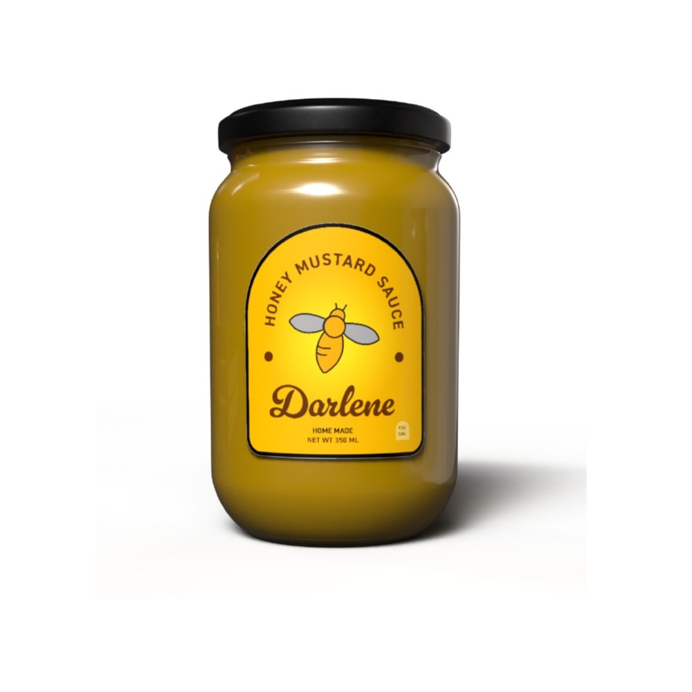
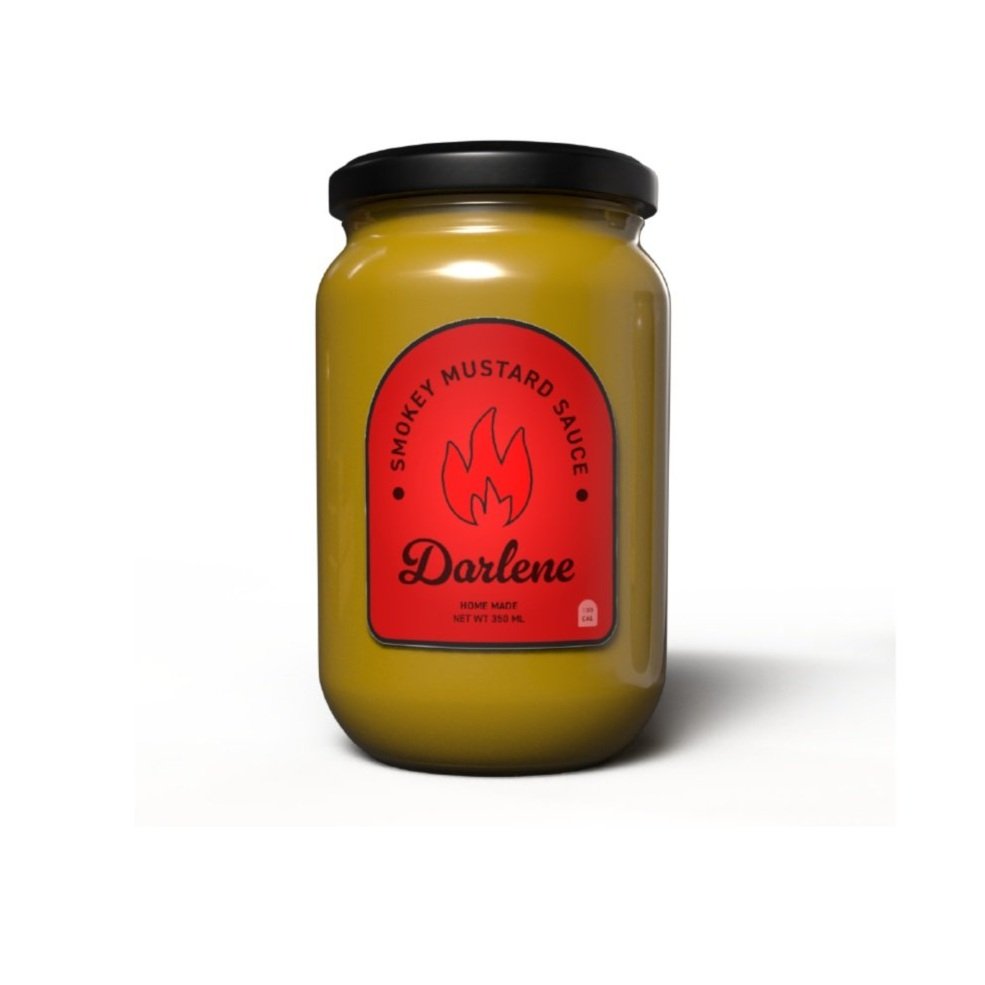
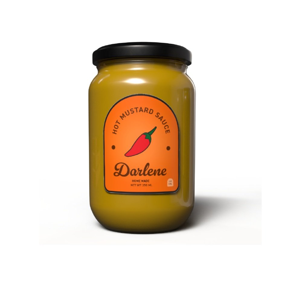
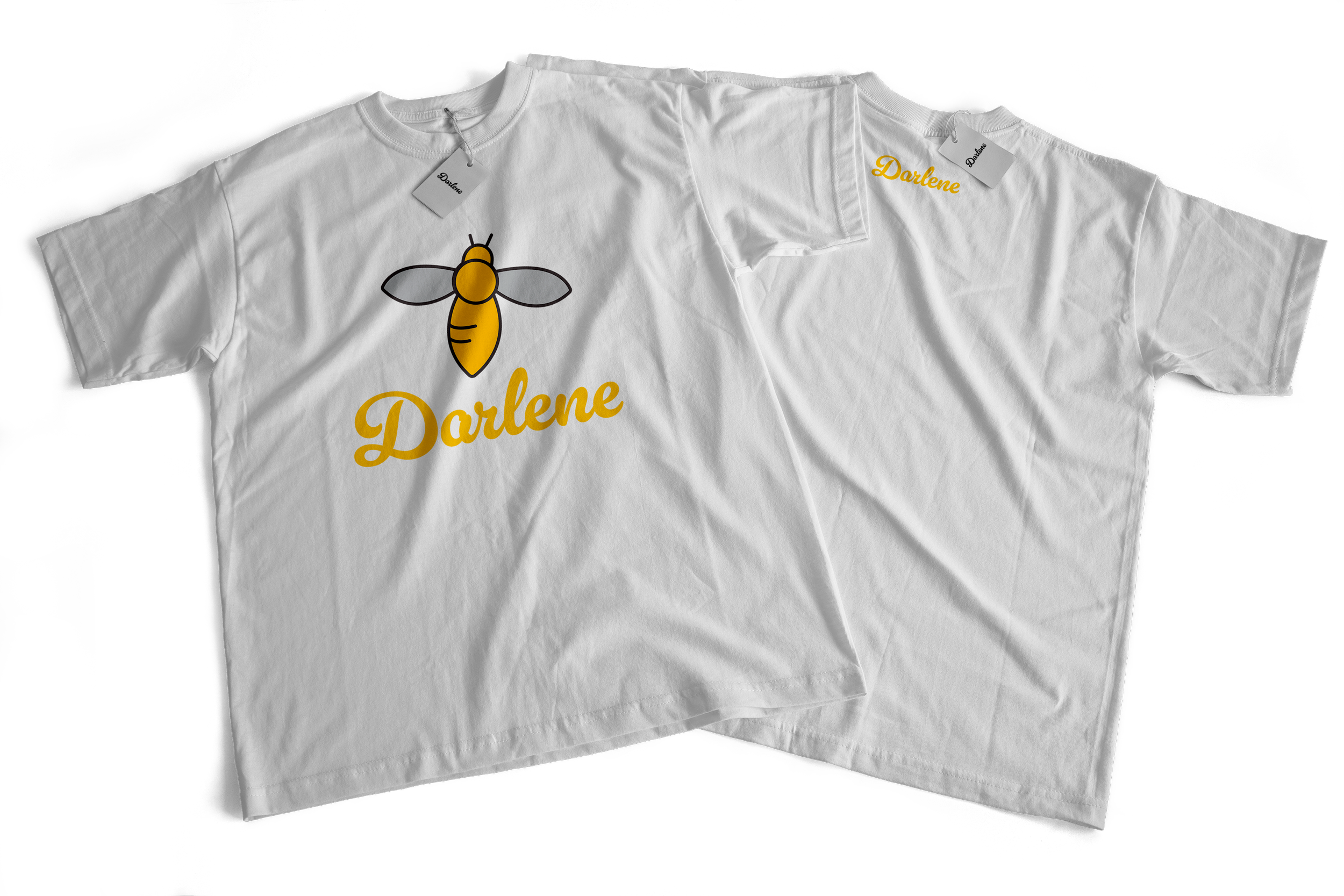
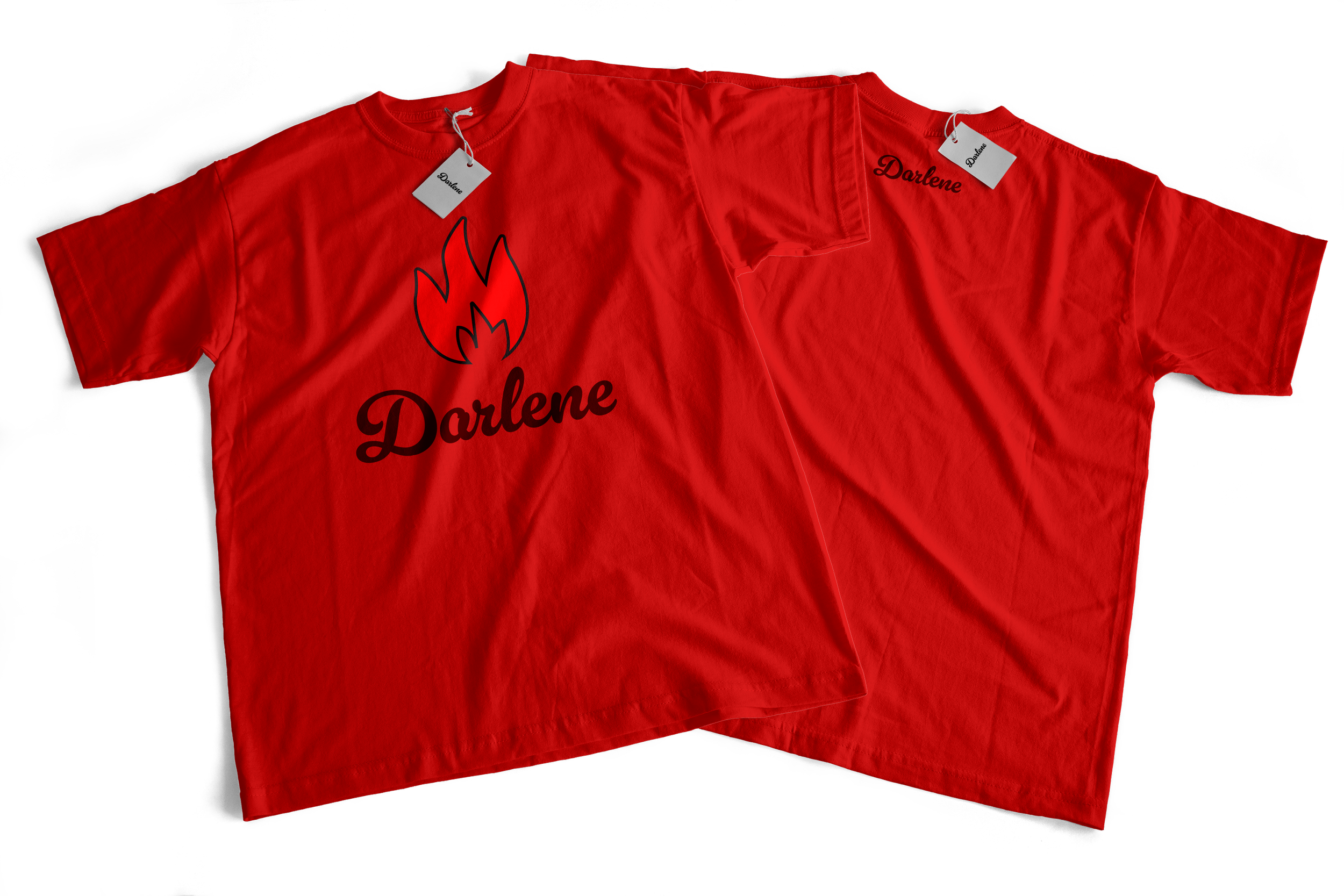
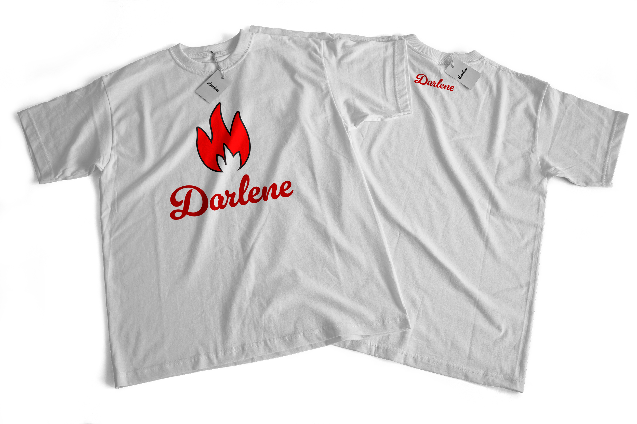
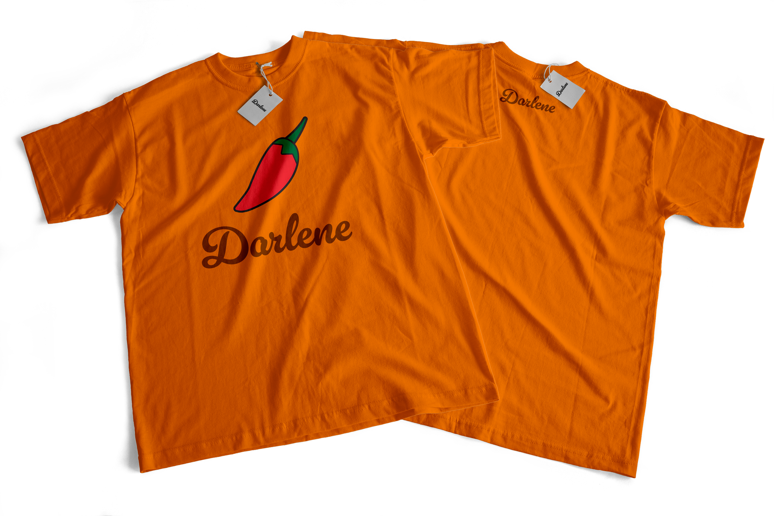
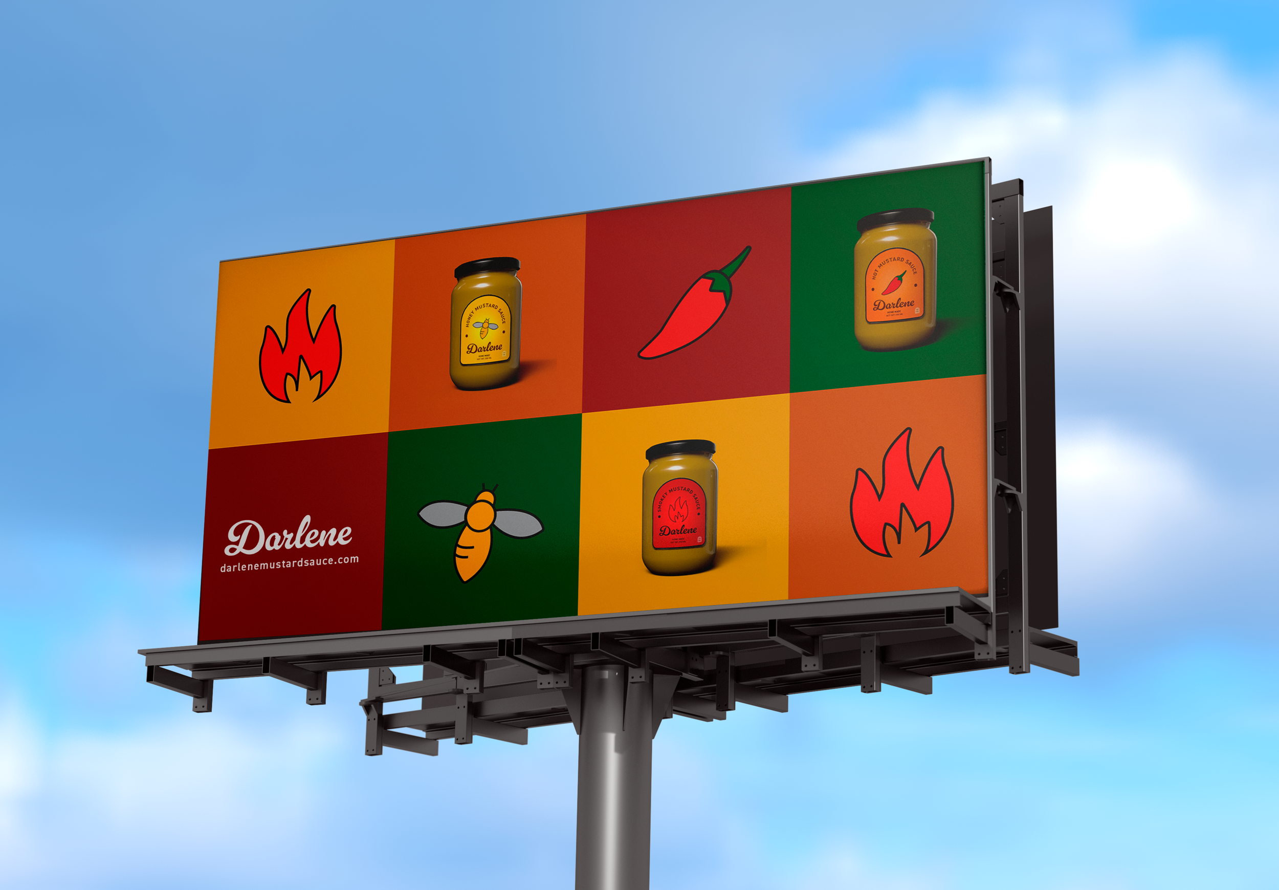
Next came the icon designs for the labels. For the icons, I hand drew each one and traced them in Illustrator to create an organic feel. Each icon represents the flavor for each mustard sauce, along with the color. For the Honey Mustard, the bee and golden yellow represents the honey. The fire and red represents the smokiness if the Smokey Mustard Sauce. Finally, the pepper icon and orange color represents the spiciness of the Spicy Mustard.
A problem that occured while creating these labels was deciding what style would fit the best with the sauce. The next problem was the icons and what icon worked best for each sauce. I struggled most with what icon to use for the smokey mustard sauce the most. I was back and forth between using the fire symbol or the pepper, and which icon will best represent that specific sauce. I landed on the fire since fire created smoke and can be seen more as a smokey symbol.
DELIVERABLES
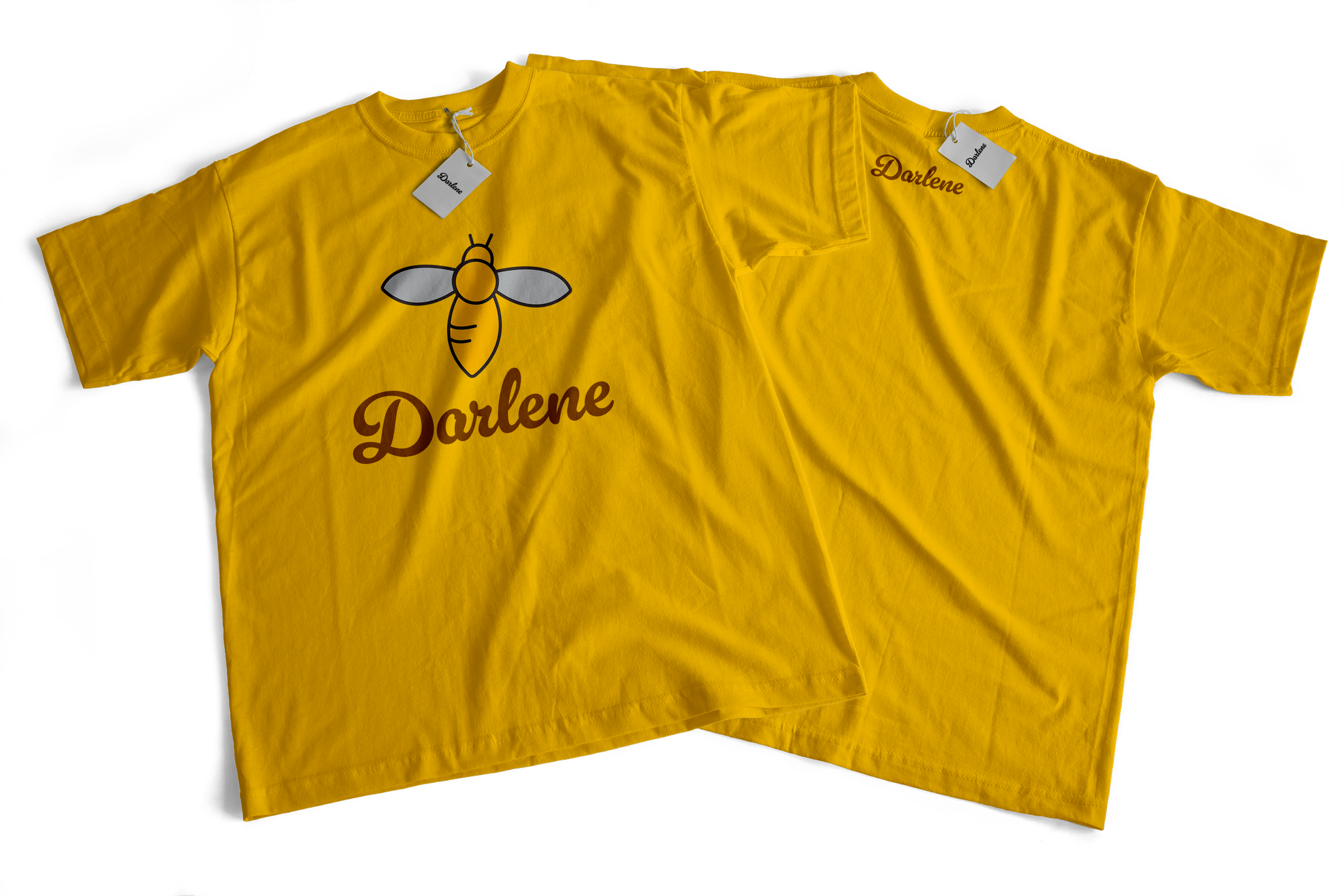
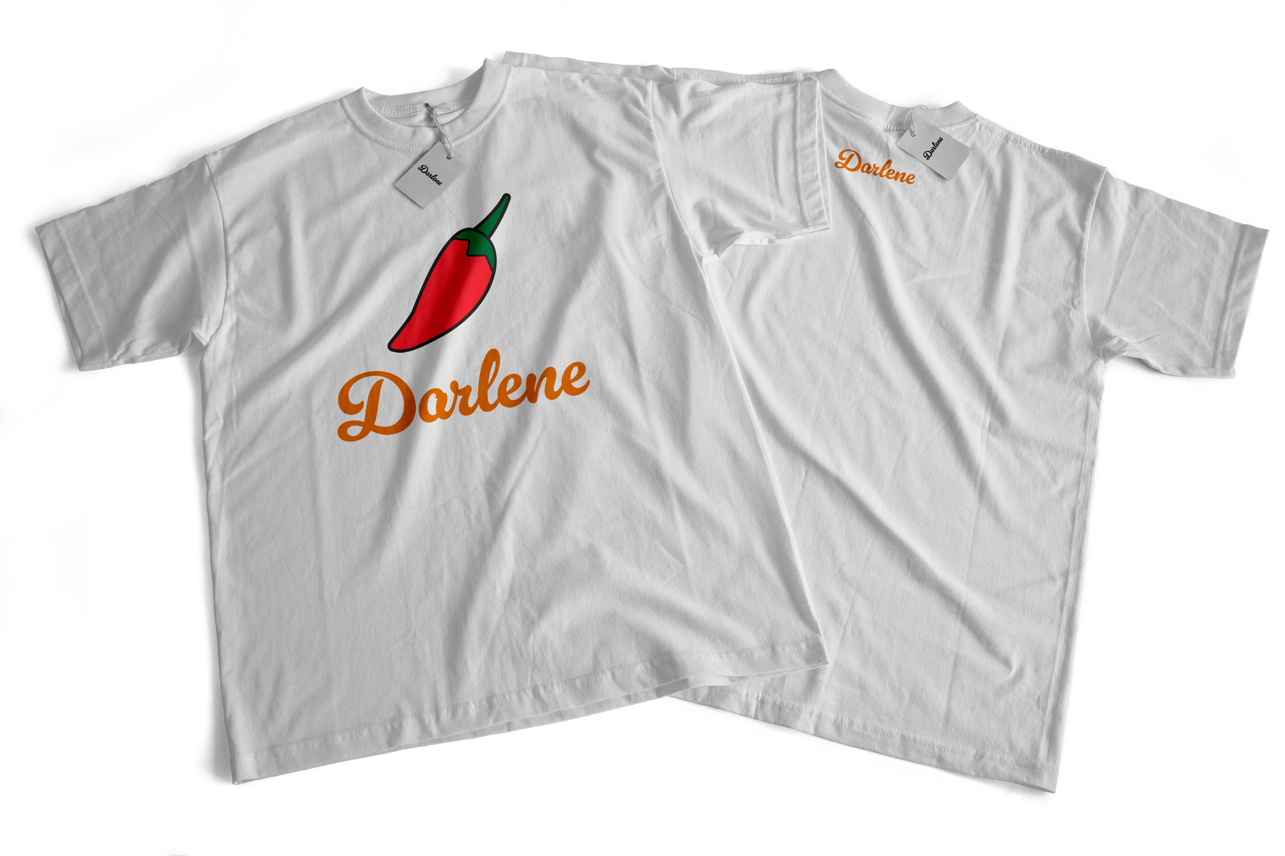
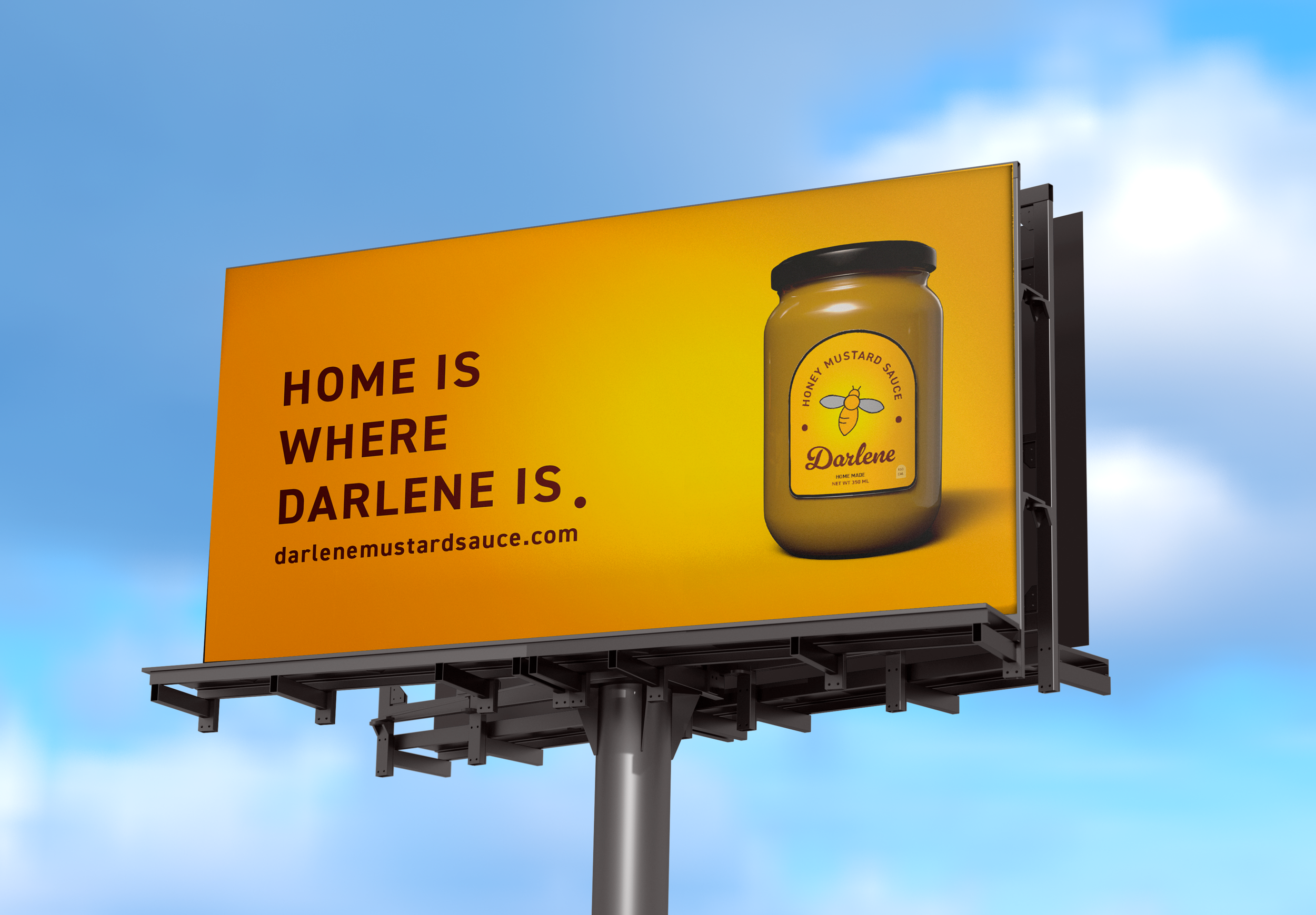
For the deliverables, I choose to do a final website that contains all my other deliverables inside such as the jars, packaging, and t-shirts. I also created billboard ADs to advertise Darlene Mustard Sauce.
CONCLUSION
Throughout the process of creating Darlene Mustard Sauce, I envisioned this sauce being on shelves in multiple stores. I see the brand expanding and adding on different sauces for customers to enjoy. I also could see marketing the sauce through a video through Youtube by using animation. Since this project is based off of my grandparents sauce, I could even see myself rebranding it to fit how they envision selling their sauce. I could see branded business cards for my grandparents and maybe adding in aprons. Could I do an app to go with the website? Maybe add in branded sauce brushes? I am excited to see what ideas I could add to this project and one day seeing my grandparents launch Darlene Mustard Sauce.


